What Are Maps?
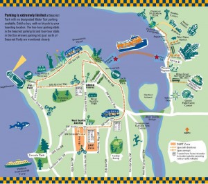
Figure 1.1: This map of public transportation routes in and around Seattle, Washington’s Elliott Bay is designed to fit in your pocket.
Image from URL: http://transit.metrokc.gov/tops/oto/m-wt2007.html
A map is a geographic representation of objects or facts that are observable in our universe. Maps are pictures that communicate a sense of place and document the features of that place. They help us record and explain the geography that surrounds us – creating a snapshot of the land, its inhabitants and the things that happen around us on the earth or above us in the sky. By representing 3-dimensional features in 2-dimensions, maps depict the real world on a flat surface. And since pieces of paper or computer files are much smaller than actual features on the landscape, maps are easy to transport, share and view.
Maps are made with a specific goal in mind. They illustrate physical traits or phenomena associated with objects, the Earth’s surface, or the cosmos. Maps can demonstrate how electrical circuits are connected in a computer, show the extent of a volcanic explosion, and create an exhibit of a star system. Any fact or event you can observe and associate with a “place” in the universe can be used to create a map.
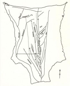
Figure 1.2: Some of the world’s oldest maps were used by native peoples to document travel routes. This is a Native American charcoal map on animal skin, showing major rivers in Illinois. The shape of the streams and distances between rivers on this map are based on how these features would look to a traveler on foot. It looks very different than modern maps of the area based on an aerial view of the rivers.
Image from URL: http://www.museum.state.il.us/exhibits/
There are two broad categories of maps: reference maps and thematic maps.
Reference maps show you where objects are located in the environment. They are called reference maps because they are used as a reference to find specific sites. A road map is a reference map used by travelers to find roads and destinations.
Thematic maps show information about locations by documenting how events or objects are distributed across the landscape. They are called thematic maps because they focus on a specific theme. A map of the temperatures around Montana on a given day would be an example of a thematic map.
There are two main types of reference maps that we use regularly: the planimetric map and the topographic map.
Maps that display public information – subway routes, the layout of a city building, walking trails, stream restoration plans – are often planimetric. Visitors to Yellowstone use the map in Figure 1.3 to determine the locations of major attractions and the distance between them.
This map uses different shades of green and grey to indicate the relative relief – the pattern of mountains and valleys across the landscape. However, a visitor planning to hike in Yellowstone would need to look at a different type of reference map that included more precise elevation information.
The type of reference map that includes location and elevation information is called a topographic map. You are probably more familiar with topographic maps than you think! For example, the maps in the Montana Atlas & Gazetteer are topographic.
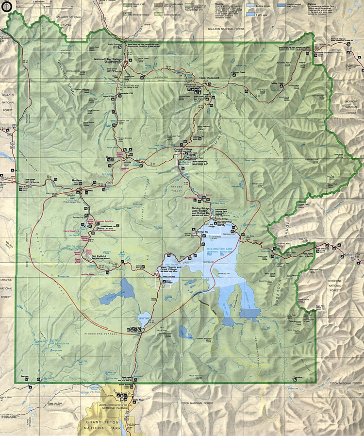
Figure 1.3: This is a planimetric map of Yellowstone National Park. Planimetric maps show where features are located in space, but do not show the elevation of those features.
Image from URL: http://www.lib.utexas.edu/maps/national_parks/yellowstone_map.jpg
Many travelers in Montana use the Atlas & Gazetteer to:
- Find out if the roads are paved or dirt in an area;
- Look at city street maps to locate museums or other public buildings;
- Determine land ownership in areas they would like to camp, hike, ski, fish, or hunt.
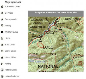
Figure 1.4: Topographic maps in the Gazetteer, like the one shown here, depict the 3-dimensional shape of the earth’s surface in 2-dimensions.
You can recognize a topographic map by looking for contour lines showing points that all have the same elevation. Contour lines represent a measurement of the relief of the landscape, indicating where hills, valleys and drainages are.
Contour lines are a fixed interval apart. On this map, contour lines are spaced at intervals of 200 feet. For example, if a contour line is labeled 6000 feet the lines next to it represent elevations of 5800 and 6200 feet.
Contour line elevations are measured in relation to a known and constant surface called a reference datum. On topographic maps, the normal reference datum for elevation is mean sea level (MSL). MSL is established by measuring sea levels over decades and coming up with an average, or mean, sea level elevation. Once established, this average point is considered to be 0 feet in elevation.
Like reference maps, a thematic map also shows the location of geographic features. Unlike reference maps, thematic maps also show information about the features.
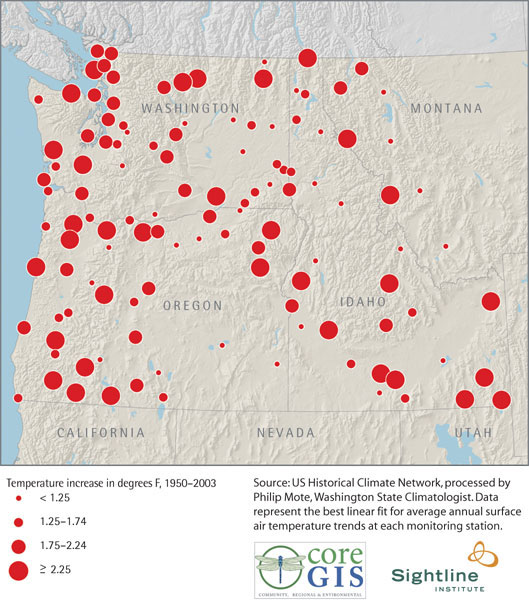
Figure 1.5: This thematic map illustrates how average annual surface air temperature in the Northwest states has increased between 1950 and 2003.
Image from URL: http://www.sightline.org/maps/maps/Energy-Climate-CS07m
A particular type of thematic map is called a choropleth map. A choropleth map uses colors or textures to show how densely the theme of interest is distributed over the landscape.
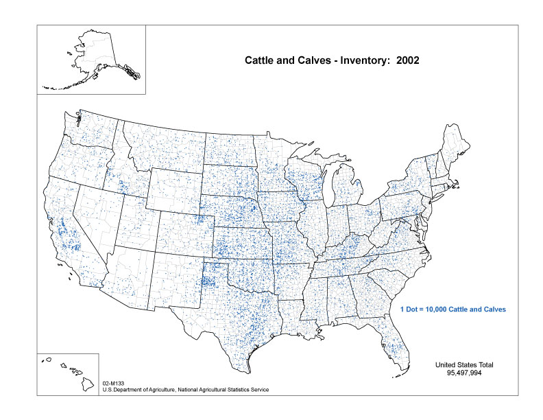
Figure 1.6: In this choropleth map, the distribution of cattle in the US in 2002 is shown. Areas that appear darker blue have a higher density of dots, which represent a group of 10,000 or more cattle. You can see that while we have a lot of cattle in Montana, they are not as densely concentrated as in Texas.
Image from URL: http://www.nass.usda.gov/research/atlas02/
From looking at these maps, you probably noticed how widely different maps can be and how many different types of information maps are designed to represent. Maps can show everything from the layout of streets in a small city to the national distribution of cattle.
Let’s think for a minute: what did all the maps you just viewed have in common?
- All of the maps represent objects and features that occur at real geographic locations. Each map shows relationships between different physical features of the earth’s surface or phenomenon distributed across the landscape.
- All of the maps use a set of symbols to represent real-world things. In the cattle inventory map, one dot represents 10,000 cattle or calves. Most of the maps have a legend explaining what the symbols mean. Some of the maps also have a title, a name or caption to indicate the purpose of the map.
- All of the maps are drawn with a different scale that is much smaller than the area of land, water, or sky being represented. Obviously a true-to-scale map of Yellowstone wouldn’t fit on a standard sheet of paper like the map you were shown. A map scale is the ratio between the distance on the map and the actual, real-world distance it represents. Many maps present the scale as a ratio called the representative fraction or representative ratio. For example, we can see on this scale from a topographic map, the representative fraction of the map is 1/62,500 (red circle):

This means that a distance of 1 inch on the map is equivalent to 62,500 inches on the ground. As 62,500 inches is approximately 0.99 miles, on this map 1 inch is roughly equal to 1 mile of actual distance. This same scale could be presented as a representative ratio of 1:62,500. This map also had a graphic scale (shown in the parenthesis), a diagram that illustrates the representative fraction.Many maps produced in the United States today present the scale of a map in both English and metric units.
Check Your Thinking: Using the representative fraction scale and the graphic scale above, determine how many inches on the map scale represent 16 kilometers (Hint: Look at the graphic scale and determine how many kilometers are equal to 1 mile):
- 1 inch
- 10 inches
- 100 inches
- 1000 inches

Click on the checkmark to view the correct answer. - All maps have a reference frame, the most common being north, south, east and west. This is most evident on the Yellowstone map (Figure 1.3), which has an arrow pointing north in the upper left corner of the map. Notice that not all of the maps actually have a north arrow or grid. Some maps rely on the convention of placing north at the top of the map. Other maps rely on the reader to recognize orientation with respect to widely recognizable geographic feature, like the outline of the United States in the thematic maps.
- Although it may not be apparent at first glance, all of the maps use some type of grid system. A grid system allows features to be located in a universally understood X-Y space using coordinates. Perhaps the most common method for dividing the Earth’s surface into a coordinate system is a geographic grid in which the distance around the planet is divided into 360 degrees. East or west degree measurements are called longitude, and runs from 0 to 180 degrees. North and south degree measurements are called latitude, and run 90 degrees north and south of the equator for a total of 180 degrees. Flathead Lake, for example, is situated approximately 114 degrees west longitude and 48 degrees north latitude.
Another common coordinate system would be the universal transverse mercator or UTM grid, which is more precise than latitude and longitude in terms of measurements down to the meter scale. Since the UTM system relies heavily on satellite data in order to be accurate down to a meter, it was initially restricted to military applications. With the advent of commercial satellite data that supports inexpensive, publicly available GPS units, the use of the UTM grid system is becoming much more common.
Two other grid systems, the State Plane and the Public Land Survey, were developed for small-scale land surveys. The Public Land Survey was used during the Colonial Era in America. While no longer in use, it is important for historical research of land documents. The State Plane was developed in the 1930’s and remains in use today.
Check Your Thinking: Looking at the map below, can you identify:
- The title of the map?
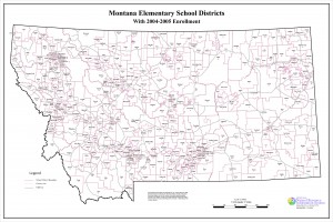
- What the pink lines represent?
- What the scale of the map is?
- What reference frame does this map use?
(Hint: Click on the map to open a larger version in a new window.)
I have a question- what is the best way to use maps with younger students?
There are many different approaches. Check out the Extension Activities for this module for more information.